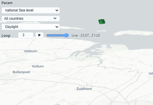
Basic map functions: zoom, pan, perspective
Pan with the mouse by holding left-click and moving in the desired direction. Zoom in or out with the mouse wheel or keyboard shortcuts (Ctrl + + / -). Vertical perspective and view direction can be changed with right-mouse drag,Ctrl + arrow keys, or Ctrl + left click-hold and move.
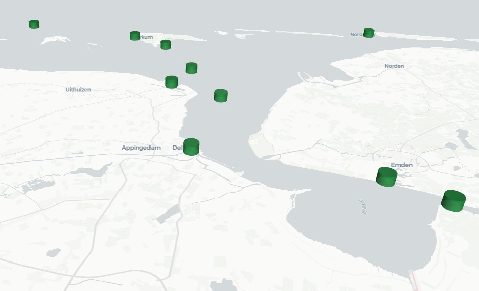
What we can see in the sea map
At the centre of the view is a dynamic geographical overview dotted with station markers in different colours and sizes. Column height reflects the measured water level.
Green: measured data, tidal phase is ebb.
Orange: measured data, tidal phase is flood.
Red: measured data, sea level above mean high water (MHW).
Grey: measured data, sea level at slack (high or low).
The tooltip window
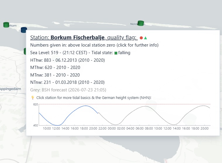
Hovering over the stations in the map a tooltip window opens. Right of the station name there are status indicators. A green dot means the latest timestamp is recent; a red dot means older data. A green triangle indicates continuity in the measured time series; red means there are gaps.
Tidal state indicates ebb, flood, or slack/stable. In the next line states the sea level in cm and timestamp of the last received measurement. The MHW (MThw) value is a ten-year mean high-water statistic and appears as a red dotted line in the sparkline — useful for storm-surge context. The HThw value represents the maximum registered highwater in the indicated time period. Analogue the low water values.
Diagram: The blue line in the diagram shows 13 hours of measured data. If a grey line follows this means forecast data for the next 24 hours. Levels are shown in centimetres, referenced to each country’s national height system. For Germany, gauge readings are initially relative to gauge zero (Pegelnull, PN), about 5 m below the official height system NHN.
The dropdown menu on top left
Parameter selection is currently limited to sea level; further parameters may follow. The countries dropdown focuses the map accordingly. The stations dropdown helps when attention is on one or more specific water bodies.
The Loop function will start a loop over selected stations. This helps to understand sea-level dynamics by means of a 24 hour animation. Selecting all stations one can see North Sea interactions with the channel and the Atlantic Ocean.
From raw telemetry to action
What you ultimately see is a bridge: raw measurements transformed into practical situational awareness. Whether someone is planning a beach visit or navigating a tidal route, the goal is the same — faster understanding and better decisions.